


AXIO Reimagination
AXIO Reimagination
A Money Managing App
UX
2 WEEKS
UI
AXIO Reimagination
A Money Managing App
UX
2 WEEKS
UI

ROLE - SOLO PROJECT
Research, Strategy, Ideation, Design System, Digital Design
Research, Strategy, Ideation, Design System, Digital Design
THE CONTEXT
Axio, a money managing app
With more and more people using digital payment methods, added with the technological advancement, the relevance of digital money managing apps has increased proportionally. Users are more wary of platforms whose interactions feel untrustworthy.
Axio, a money managing app
With more and more people using digital payment methods, added with the technological advancement, the relevance of digital money managing apps has increased proportionally. Users are more wary of platforms whose interactions feel untrustworthy.
THE SCOPE
THE SCOPE
Week 1
Week 1
Week 1
Week 1
Start
Start
Start
Start
Start
Start
Start
Start
Week 2
Week 2
Week 2
Week 2
Research
Research
Research
Research
Strategy
Strategy
Strategy
Strategy
Digital Design
Digital Design
Digital Design
Digital Design
Ideation
Ideation
Ideation
Ideation
Design System
Design System
Design System
Design System
THE GOAL
THE GOAL
The goal here is to understand what are the problem areas that are faced by the users while analysing transactions, setting budgets and splitting transactions. Through reimagination of the screens and navigation, I will propose possible solutions keeping in mind the strategy requirements of the company.
The goal here is to understand what are the problem areas that are faced by the users while analysing transactions, setting budgets and splitting transactions. Through reimagination of the screens and navigation, I will propose possible solutions keeping in mind the strategy requirements of the company.

1. Discovery and research
1. Discovery and research
The first step in the reimagination was to understand what was going wrong. To do this, conducted basic secondary (Competitor Analysis) and primary (User Interviews) research.
These were the findings derived.
The first step in the reimagination was to understand what was going wrong. To do this, conducted basic secondary (Competitor Analysis) and primary (User Interviews) research.
These were the findings derived.
User Quotes
User Quotes
“It’s less of there is a lot of info here’ and more of ‘where is more?”
“It’s less of there is a lot of info here’ and more of ‘where is more?”
“Overwhelming”
“Overwhelming”
“I felt that for a finance app, splitting would be one basic but prioritised feature.”
“I felt that for a finance app, splitting would be one basic but prioritised feature.”
Convey all the information users need efficiently to ensure that the users need not rely on their memory rather than their intuition.
Convey all the information users need efficiently to ensure that the users need not rely on their memory rather than their intuition.
Convey all the information users need efficiently to ensure that the users need not rely on their memory rather than their intuition.
Convey all the information users need efficiently to ensure that the users need not rely on their memory rather than their intuition.
1
Emphasize and highlight the important information needed by user to navigate as well as based on the goals of the app.
Emphasize and highlight the important information needed by user to navigate as well as based on the goals of the app.
Emphasize and highlight the important information needed by user to navigate as well as based on the goals of the app.
Emphasize and highlight the important information needed by user to navigate as well as based on the goals of the app.
2
Prevent user misjudgments due
to unclear signifiers and Club similar actions together.
Prevent user misjudgments due
to unclear signifiers and Club similar actions together.
Prevent user misjudgments due
to unclear signifiers and Club similar actions together.
Prevent user misjudgments due
to unclear signifiers and Club similar actions together.
3
Competitor Analysis
Competitor Analysis
Screens and navigation of competing products are assessed and compared to see what others are doing and what we can do better. Here i was mindful of the fact that the goals of all apps may not be the exact same.
Screens and navigation of competing products are assessed and compared to see what others are doing and what we can do better. Here i was mindful of the fact that the goals of all apps may not be the exact same.
Expense Manager

Money Manager
Money Manager

2. Problem and strategy definition
2. Problem and strategy definition
Here, I took a closer look at the screens and what were possible places where interaction was becoming weak. These are called pain points. Heuristics method was used to locate these pain points.
Here, I took a closer look at the screens and what were possible places where interaction was becoming weak. These are called pain points. Heuristics method was used to locate these pain points.
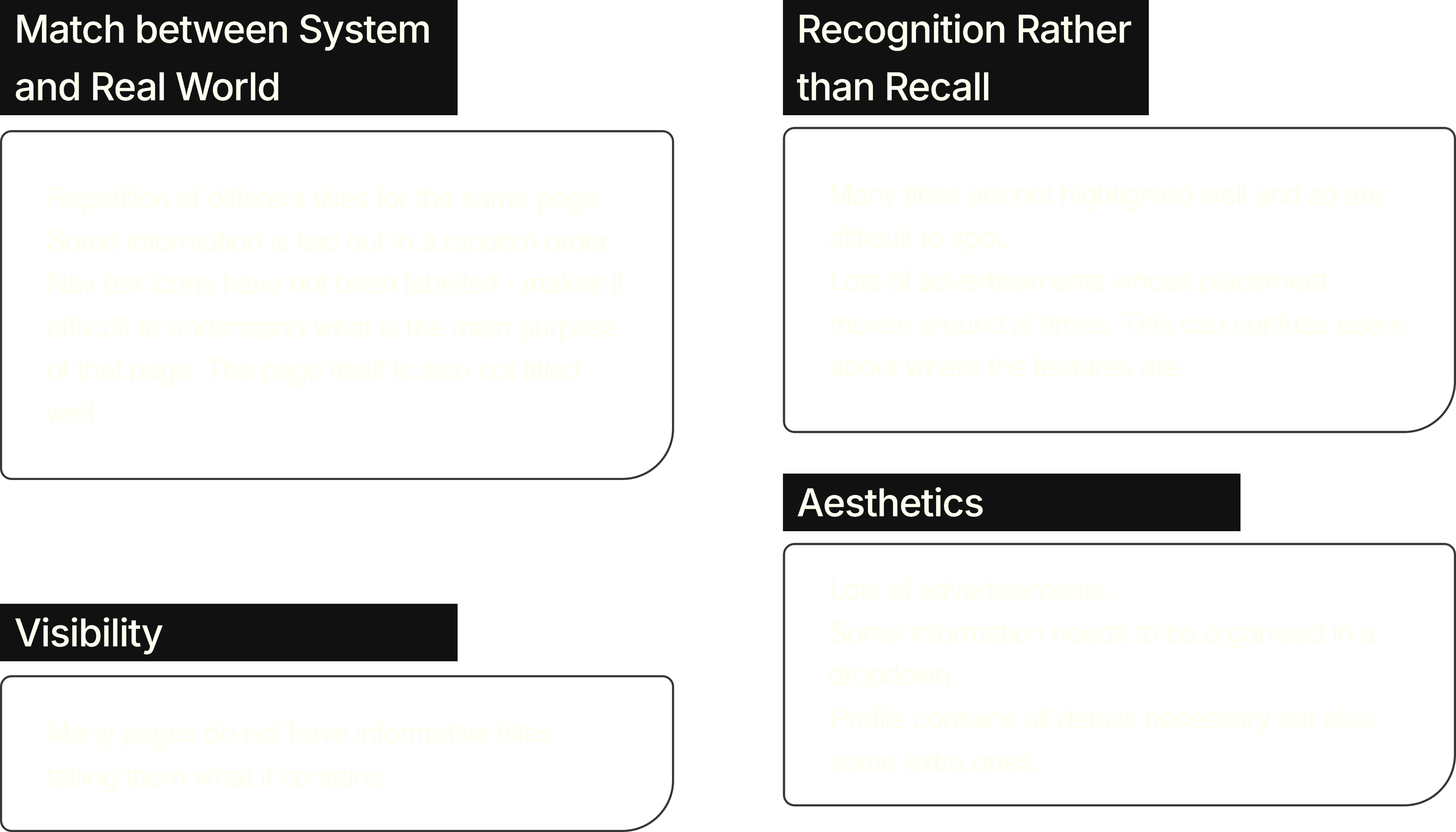
Pain Points
Pain Points


Heuristic Violations
Heuristic Violations
Information Architecture
Information Architecture
With the derived pain points in mind, I modify the information architecture of the app navigation.
The major changes made include cleaning up the tracker page to make priority tasks and information easy to see, addition of the budget under profile section and bringing out unnecessarily hidden statistics on the stats page to the front.

3. ideation
3. ideation
Here, I took a closer look at the screens and what were possible places where interaction was becoming weak. These are called pain points.
Here, I took a closer look at the screens and what were possible places where interaction was becoming weak. These are called pain points.
After
Before


After
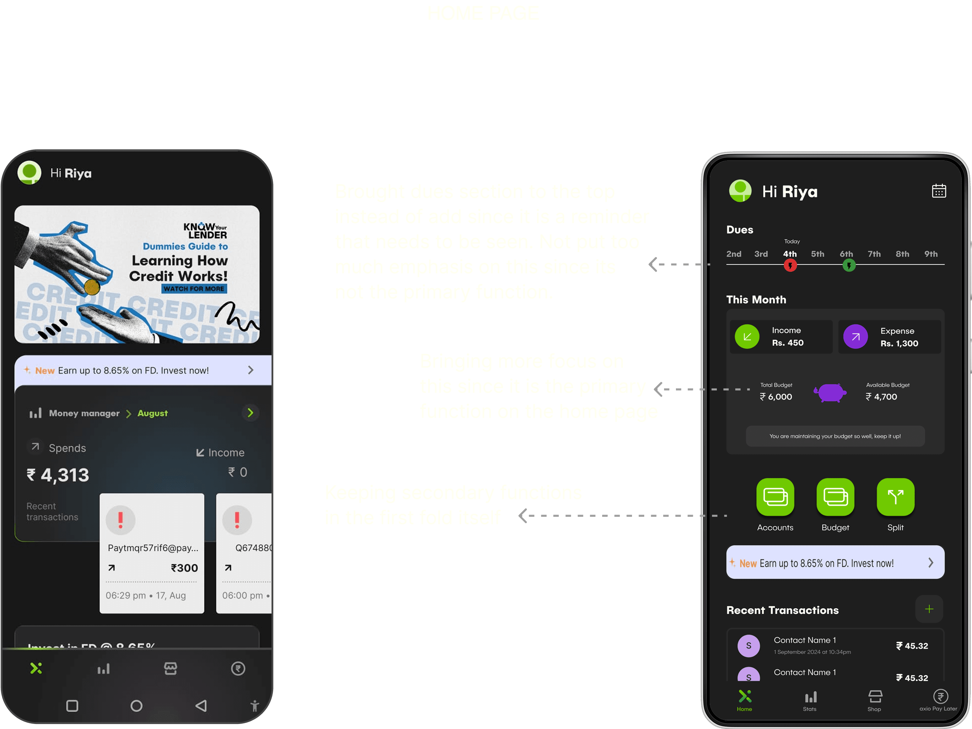
Tracker Page
before
Pushing down Recent Transactions since it down not need much real estate on the trend page while the trends are hidden away, accessible only through CTAs.
Real world connect with the tracker - Piggy bank
Bringing the trends and categories out in a vertical and carousal scroll
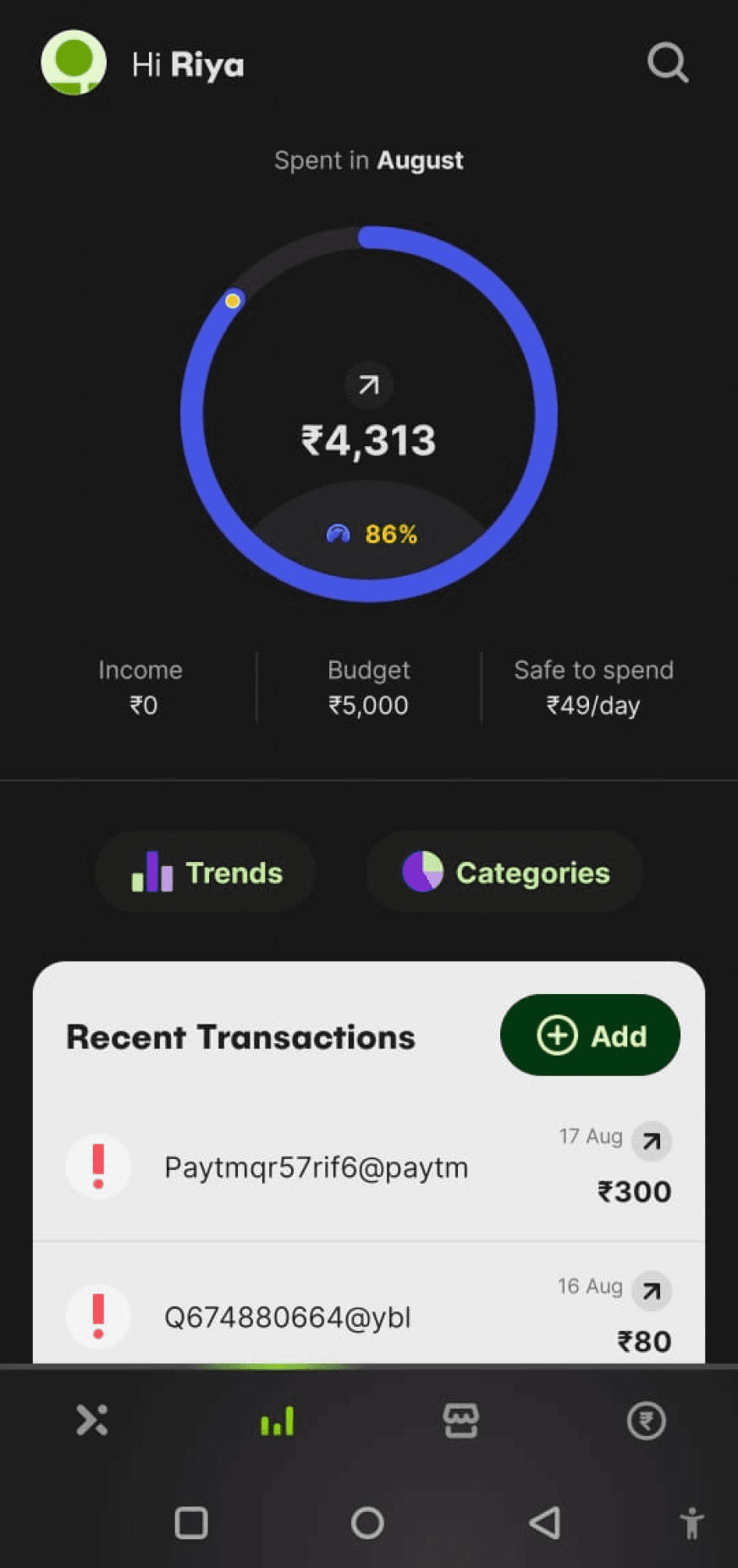
Tracker Page
Motivational message about budget maintenance changes as you get closer to crossing your set budget.
-700 indicating that the amount spent over budget is Rs. 700
Wanted to show the piggy bank breaking when the budget is crossed

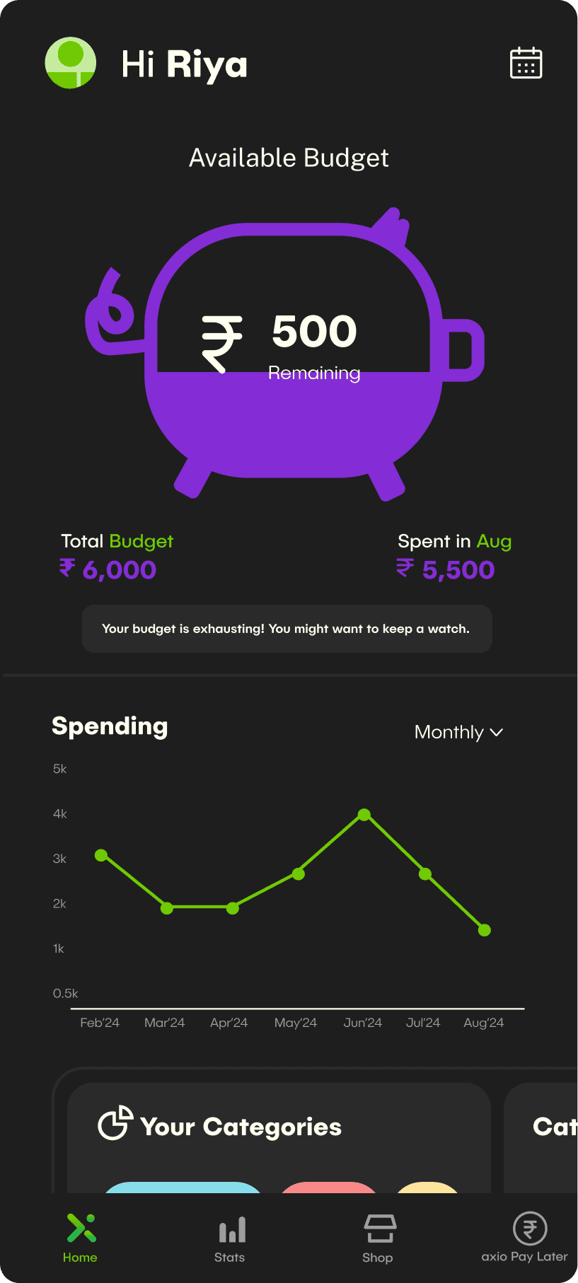

Budget crossed
Budget maintaining
Budget maintained
Added a filter to see recent transactions sorted by category.
Recent Transactions Page
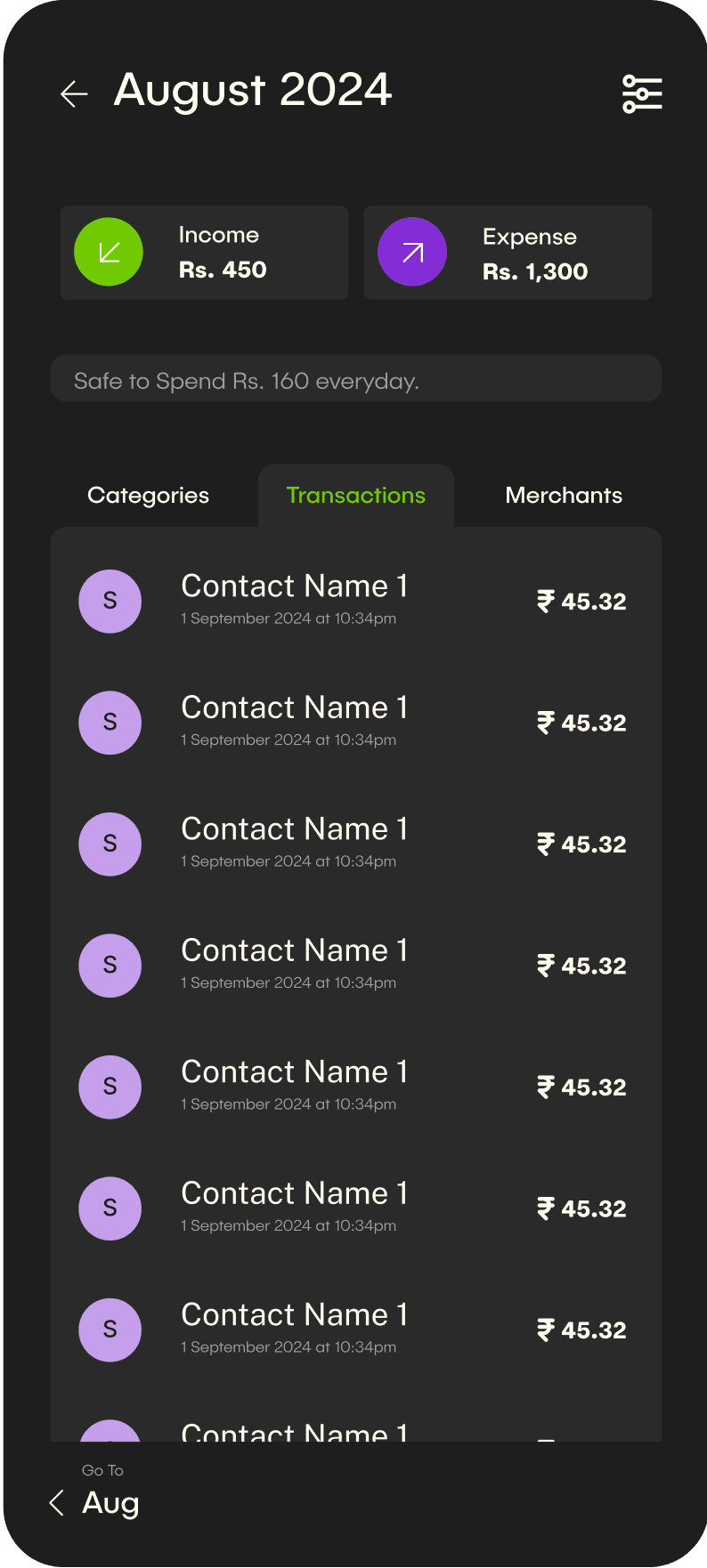
Sort by
Groceries
Unknown
Shopping
Transport
Home
Date
Unsettled
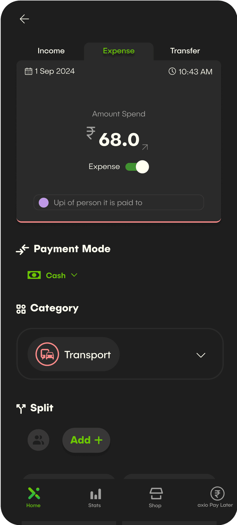
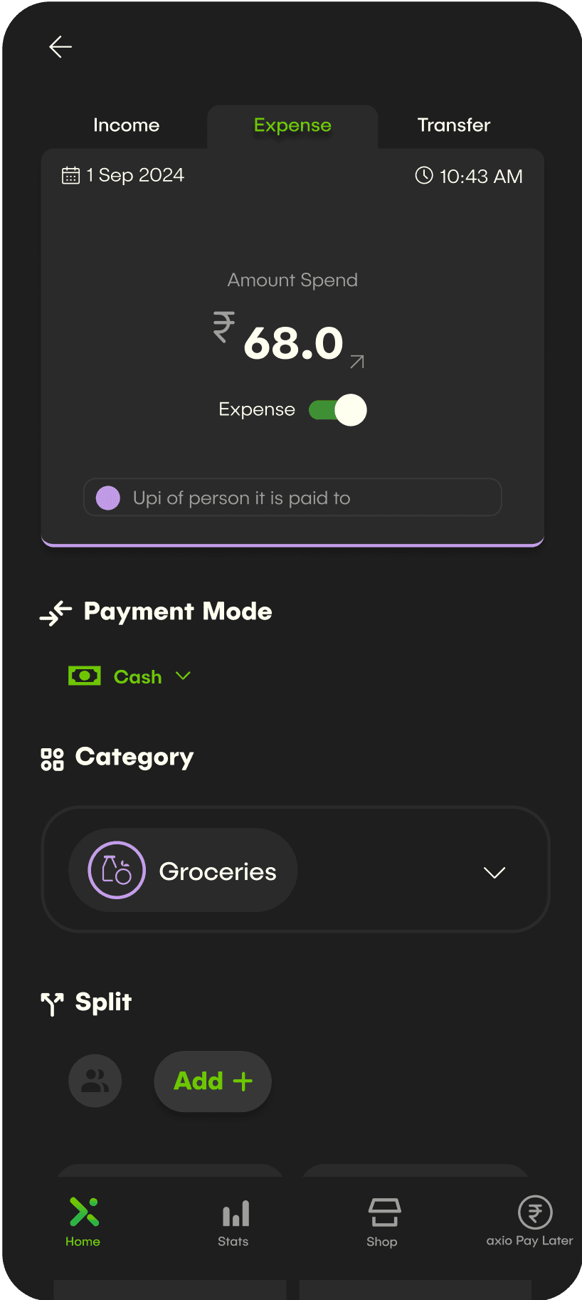
Add Transactions Page
Toggle to add either income, expense or transfer.
Categorised as transport
Categorised as grocery
Uncategorised

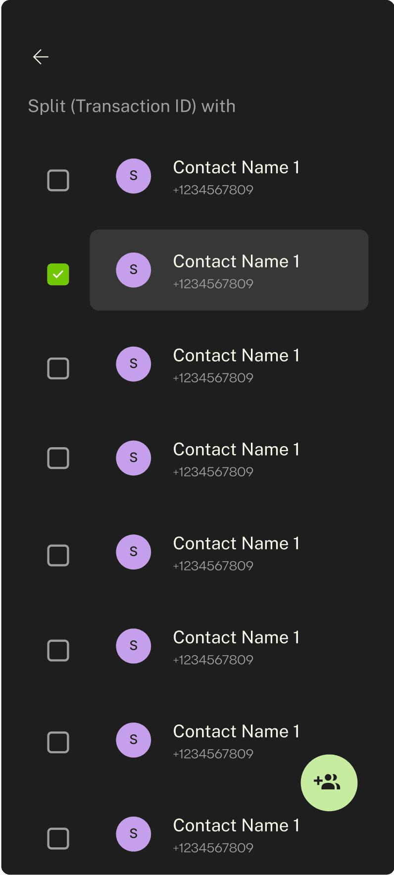
Contacts Page
Wanted to make the option to multi select contacts more intuitive
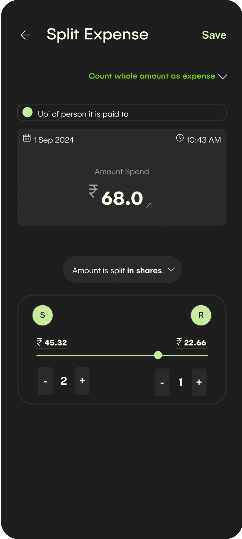
Split expenses Page
Wanted to visually show the split transaction
Discard transaction changes?
You will loose all the changes you made.
Discard
Keep Editing
Save changes?
The transaction changes you made will be editable later.
Keep Editing
Save

After
Before
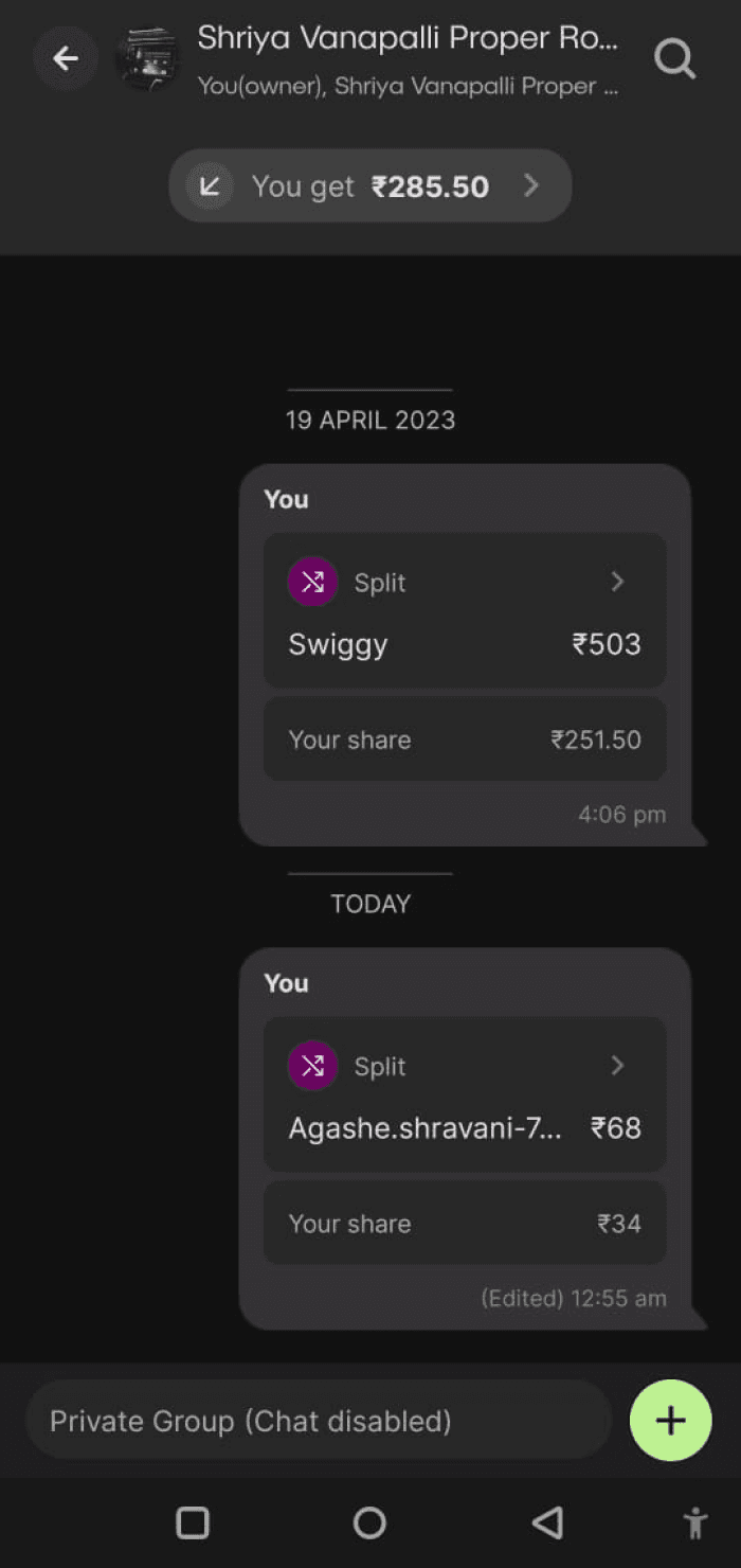
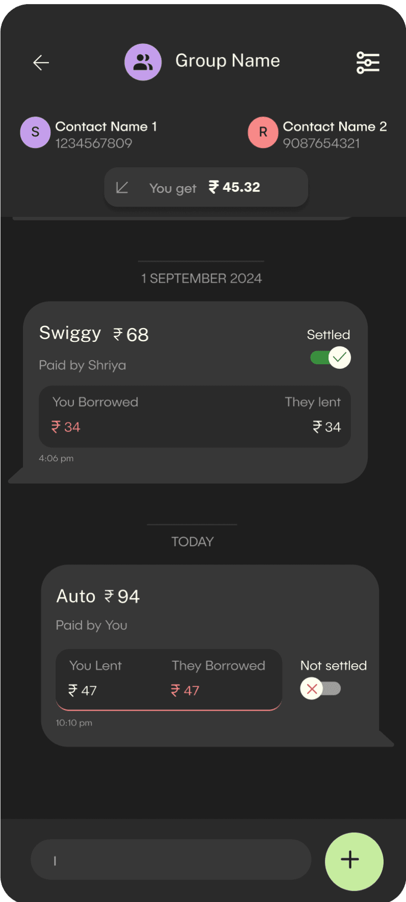
Split expenses Chat
Wanted to make the card such that it conveyed all information the user needed about a split transaction.
Sort by
Groceries
Unknown
Shopping
Transport
Home
Date
Unsettled

Before
After
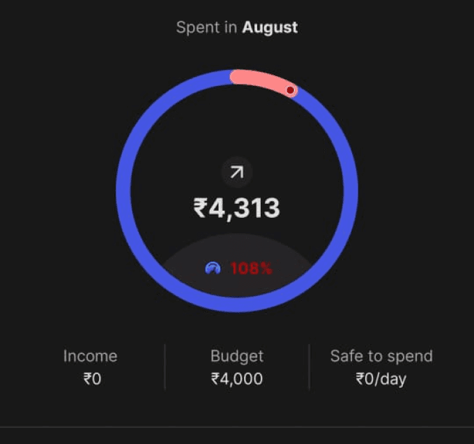
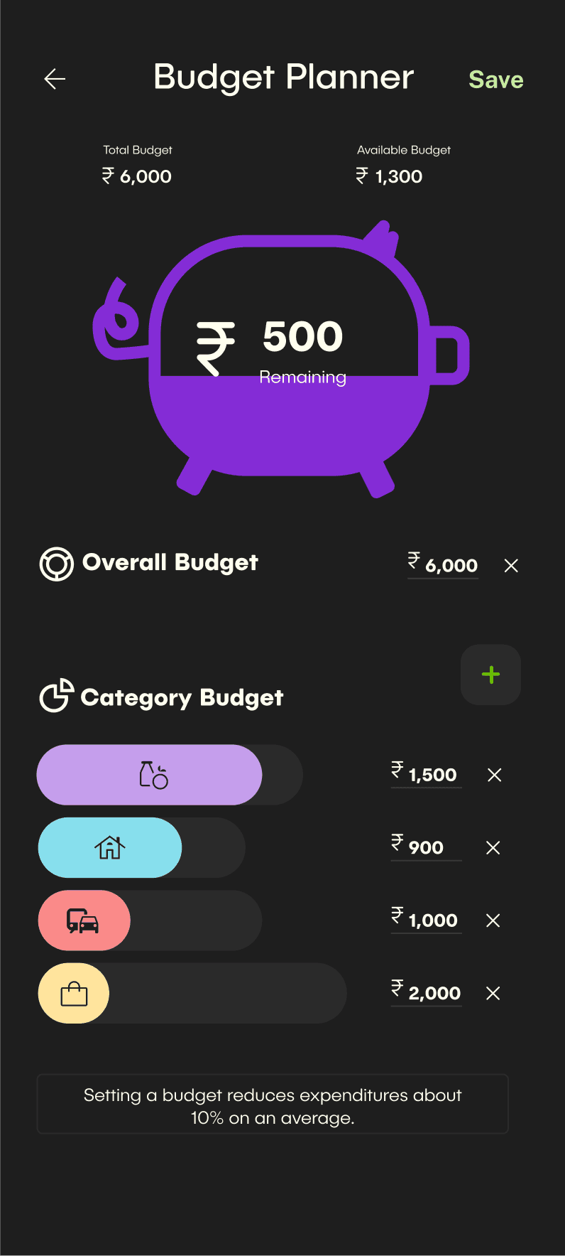
Budget Planner Page
Wanted to visually show the categories and their budget

Before
After
4. design
4. design
Design System
Design System
Typeface - Publica Sans Round
This was used in varying sizes and weights for heading, body, button and note text.
Primary Brand Colour:
#70C901
#70C901
#70C901
#70C901
#70C901
#70C901
Neutrals:
#1E1E1E
#2A2A2A
#666664
#9e9e9e
#fffeff
Componant Colours:
#C59EEC
#FA8A89
#87DFED
#FFE49D
Accent:
#842CD6
Semantics:
#DD3131
#398E3D
Check out the prototype:
Check out the prototype:
Link to prototype